Whirlwinds at Art Wynwood: Bernie Taupin’s Painted Words

By Bruce Helander
The winds of change, imaginary currents of invention and practicality, often find their way by slowly drifting into an urban neighborhood that has the potential to be reinvigorated into an area with a more useful purpose; adaptively improving abandoned buildings and warehouses that are forgotten and overlooked, giving them a new life. These rare opportunities make artists aspire, art dealers dream, and speculators spend. The best known example of this positive art world “ripple effect” is SoHo, the famous Lower Manhattan neighborhood set in the now historic Cast Iron district, which made a remarkable transition from industrial use to an intra-city regeneration.
Like SoHo, the energetic Wynwood Arts District in Miami has a direct connection to the development of substantial art-related locales as designated hot spots, where supply and demand and strength in numbers dictate where the art community can affordably roam. Art Wynwood, Miami’s premier winter art fair now in its fifth season, has made this distinguished area its home for this and other nearby seasonal fairs, and continues to grow exponentially. This annual Presidents Day weekend/five day event also includes a dynamic array of works from street artists and muralists who take a cue from the amazing number of permanent wall art installations in the surrounding neighborhood, spearheaded years ago by the late Tony Goldman. In addition, this is the fair to catch if you are interested in getting the inside story on emerging young talent from around the world, as well as important mid-career and world-renowned contemporary and modern artists.
One exhibiting artist in particular, Bernie Taupin, a British-born, California-based painter who is now an American citizen, surely has a great deal in common with the communicative nuances inspired by risky urban “tags” of street art and the inherent energy and political power tools of stenciling letterforms; blasts of spray paint; images created over unique textured surfaces; stamping out recognizable symbols; and utilizing target shapes and flag images. From my point of view, his work also is among the freshest and most appealing in the fair, portraying an unusual and painterly clarity of rhyme and reason. The entry doors to the fair will be flanked at both sides with large printed replica murals of Taupin’s original titled Sleeping Beauty, its U.S. flag subject matter commemorating Presidents Day weekend.
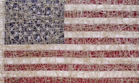
In his new dramatic series presented by Waterhouse & Dodd (New York and London) at Art Wynwood, Taupin often moves back and forth from an abstract expressionist mode, to assemblage that often employs wrapped string as well as saturated color field compositions, to a particular fascination with the stark beauty of the stars and stripes of the American flag. This artist’s iconic style after thirty years of serious painting has evolved into incorporating letterforms and phrases and memorable titles, and likely can be traced to his legendary talents as a songwriter, a pursuit with which many artists who also have made music can identify. After all, it is a lyricist’s responsibility to ‘paint’ with words pictures that you can’t see, so it follows quite naturally to make paintings that you can read. There is an honorable tradition of integrating alphabetical fragments in modern art, beginning with Braque and Picasso’s Cubist period, where letters were either painted, stenciled or collaged onto revolutionary canvases. This pioneering spirit of applying letterforms, especially stenciled shapes, is still used by contemporary visionaries like Jasper Johns (alphabets), Ed Ruscha (printed observations), Mel Bochner (Blah, Blah, Blah), Barbara Kruger (I shop therefore I am), Shepard Fairey (OBEY), Jenny Holzer (projections, such as Money Creates Taste), and most recently Christopher Wool (stencils like SEXLUV, as shown in his masterful Guggenheim survey).
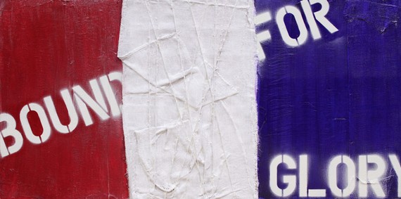
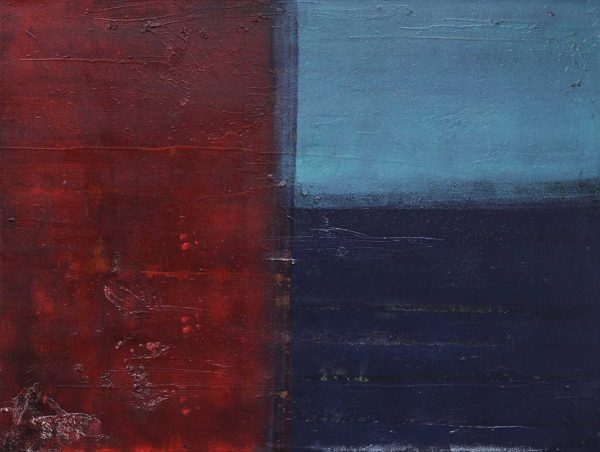
It should be noted that Taupin also demonstrates a powerful chemistry and instinctive aptitude with painterly shapes and color, as in his early non-narrative, heavily pigmented works of handsome rough square shapes on a field in a vibrant hue, which owe a tip of the hat to Hans Hofmann. Another exceedingly striking and refined piece is Civil War Trilogy 1 The Union, where Taupin unequivocally establishes an insightful ability to create beautiful surfaces that merge minimalist shapes in perfect harmony.
It is an extension of one’s creativity and vision to assimilate all of life’s past experiences and professional agility into one’s work. Taupin’s Bohemian mother was a valuable inspiration to him, as she exposed him as a young artist to leading modernist painters of the 1960s and 1970s and encouraged him to visit museums. She had studied French Literature, and his maternal grandmother taught the classics and graduated from the University of Cambridge, so it’s not surprising to learn that he logically inherited an early appreciation for descriptive words, prose and narrative poetry, coupled with a strong interest in art history and art. He grew up on a farm, and I can tell you from personal experience, that being saturated and surrounded with the properties of the earth, inhaling its enriched soil, the Burnt Sienna-tinted mud connected to its environment makes a permanent impression, and for many of us, especially artists, often influences the way we look at art. As a young man, Taupin spent many hours contemplating the works of German painter and collagist Anselm Kiefer and his innovative use of soil mixed with straw. In Taupin’s The Barricade, one can appreciate his obscure but wonderful homage—with a twist—to Kiefer.
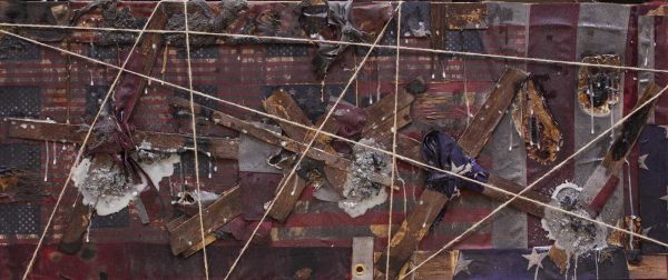
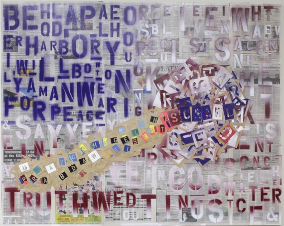
He also was encouraged to carry a sketchbook, building his innate talent, and as his enthusiasm progressed towards painting he became a fan of J. M. W. Turner. Later, as a teen, he developed a taste for abstract expressionist gestures by Antoni Tàpies and Hans Hofmann, whose works he would discover in New York galleries and museums. Taupin has assimilated his past with a magical lyrical approach to his current picture-making, as he dices and slices and basically synthesizes his signature styles and ideologies, and mixing them up with a variety of recognizable ingredients as he explores the visual relationships between color and texture and word and image equations. His handsome composition Scrawl is a particularly fascinating work in terms of his inventive use of stencils, which produce colorful silhouettes that offer only bits and pieces of words, such as “for Peace” or “Truth.” In this painting, which could serve as a book jacket for Tom Wolfe’s classic exposé on the art world, “The Painted Word,” Taupin has fashioned a dazzling, transparent, marching circus of letterforms on newsprint that becomes a challenging crossword puzzle of sorts. Here Taupin not only spray paints meandering, upper and lower case letter shapes vertically and horizontally, but secures the actual stencil onto the canvas for a perfect yin yang of positive and negative space. In other works, Taupin creates a vigorous, colorful background where he often places a single curious word like ‘bang’ or ‘scar’ or ‘explore.’
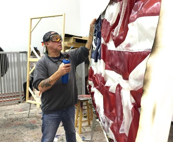
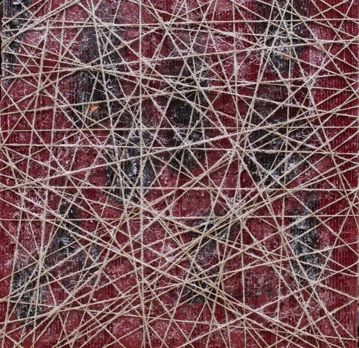
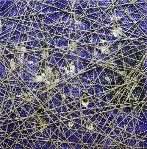
And finally, a salute to Taupin’s Flags of our Founders series, where the artist has taken a recognizable, respected image and tied it down under swirling layers of twine, nearly obscuring the outlines of red, white and blue, which also seem to be akin to minimal compositions created by the artist years ago. In Sleeping Beauty (pictured above), Taupin offers the viewer a secure patriotic symbol that is tightly wrapped like a Christo object, as if to protect its dignity and importance to our history. Ironically, the repetition of the strings, coming from all directions and on an angle, create their own pattern of star shapes, which complement the horizontal bars hidden underneath. This work might pose the question and offer the interpretation: are we as a country tied up in a web made of layers of contradictions that often dilute common sense and vision, obscuring our greatest symbol of freedom?
This article was originally published by HuffPost